P R O B L E M
Outdated and Dysfunctional Website
KTRU’s outdated website has broken features and poor navigation, disrupting user experience and accessibility.
G O A L
Revamp the Website for Usability
Redesign KTRU’s website with a cleaner, more intuitive interface while maintaining its signature branding.
I M P A C T
Enhanced User Engagement and Clarity
The redesigned interface improves navigation and DJ visibility, receiving positive feedback for aligning with KTRU's brand and boosting user experience.
T E A M
4 Designers
D U R A T I O N
10 weeks
Y E A R
2024
R O L E
UI/UX Designer
C U R R E N T S T A T E O F W E B S I T E

B R A N D A T T R I B U T E S
Quirky, Countercultural Identity
KTRU’s brand embraces a bold, minimalist aesthetic with a distinct “KTRU-core” vibe, standing apart from mainstream music. Key website features include preserving the iconic color scheme and prominently displaying the logo to maintain its bold, underground feel.
C L I E N T F E E D B A C K
Prioritize Functionality and Updates
The client and KTRU DJs emphasize fixing the "Listening Now" feature, updating outdated elements, and highlighting the DJ application, events, and social media.
M o o d b o a r d
U S E R R E S E A R C H
How does the target audience engage with Ktru’s website?
D E S I G N I T E R A T I O N S
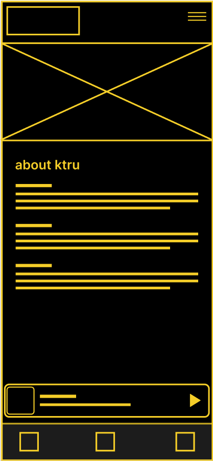
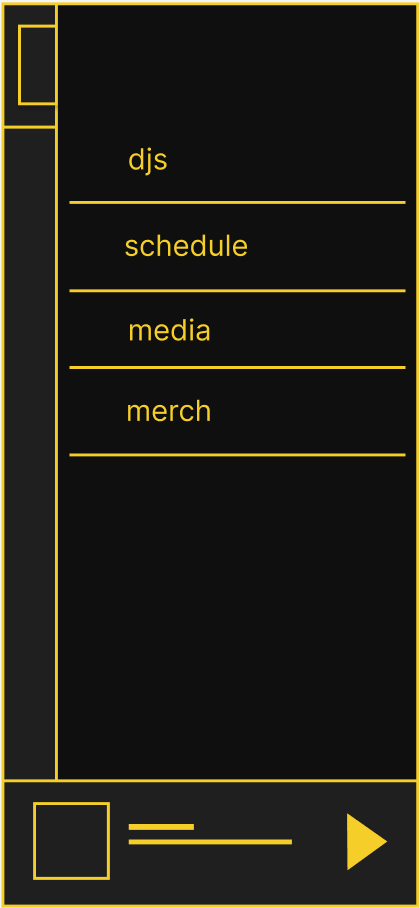
Low-fidelity (mobile)
Focus on major changes such as navigation tabs, media (blog posts, reviews, etc.) page revamp, and 'about' page design datedness.
About
Navigation
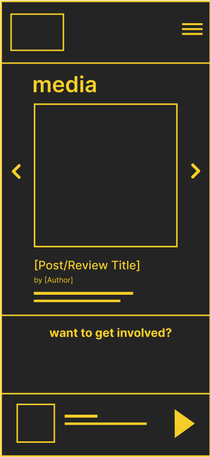
Subpage Example
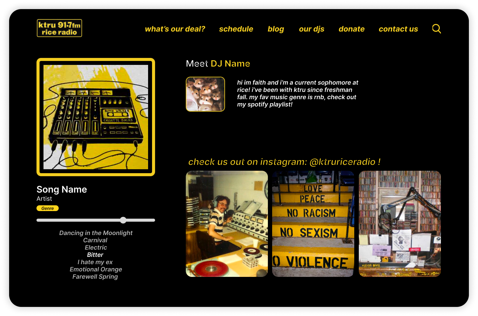
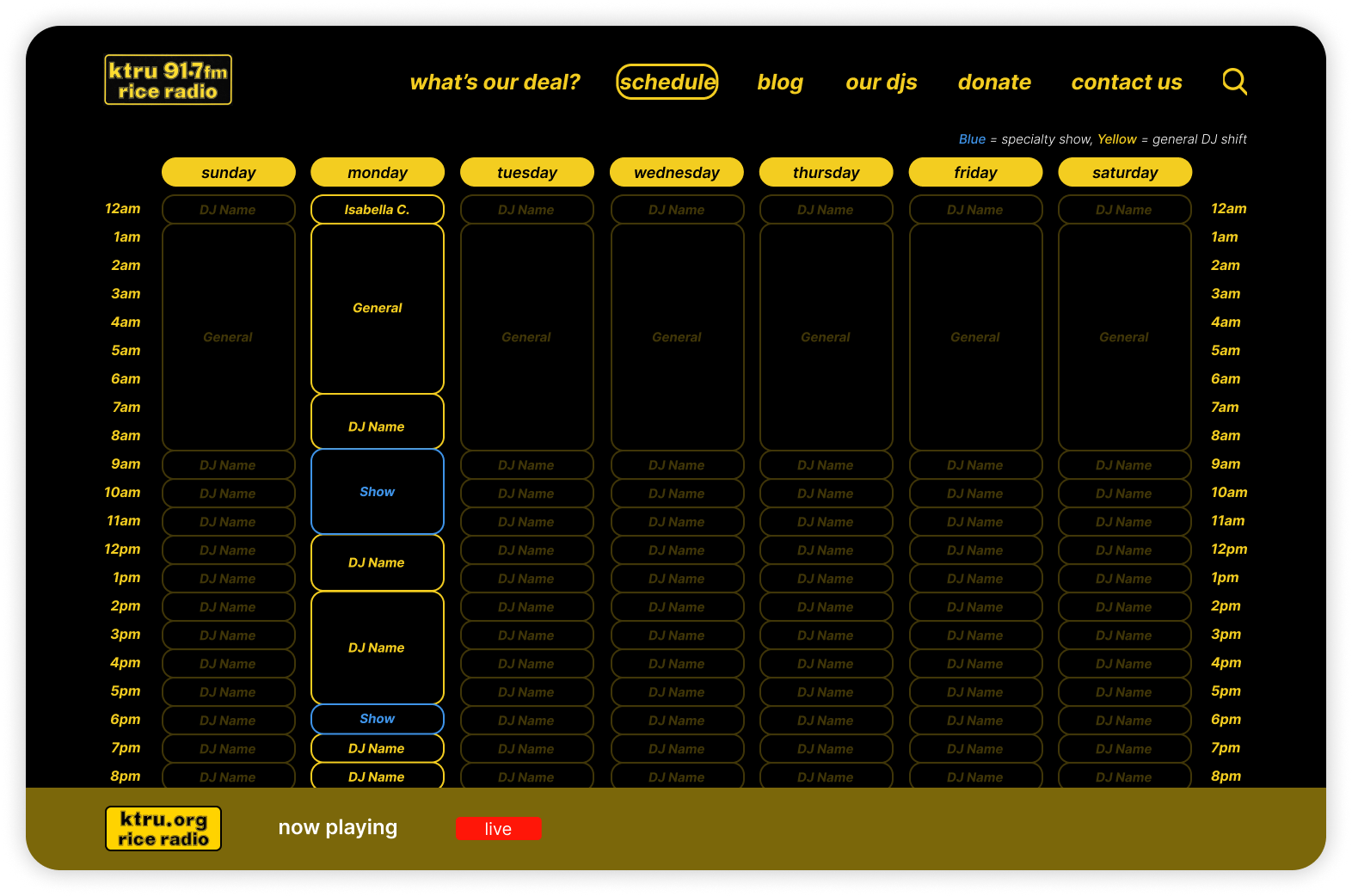
Mid-fidelity Design (desktop)
CURRENT STATE OF WEBSITE
• Cluttered schedule layout with small, hard-to-read text
• Hard to find the current DJ
• No clear visual hierarchy; disorganized schedule
• Design feels unprofessional and doesn't match radio's identity
• Hard to find the current DJ
• No clear visual hierarchy; disorganized schedule
• Design feels unprofessional and doesn't match radio's identity
PROPOSED REDESIGN (ITERATION 1)
• Streamlined, minimalist layout for easier navigation
• Clear visual cues: current DJ and day highlighted; rest faded but visible
• Separate weekly schedule tab for better organization
• Black-and-yellow color scheme retained, more polished
• Clearer times, no distractions
• Improved readability; aligns with KTRU's aesthetic
• Clear visual cues: current DJ and day highlighted; rest faded but visible
• Separate weekly schedule tab for better organization
• Black-and-yellow color scheme retained, more polished
• Clearer times, no distractions
• Improved readability; aligns with KTRU's aesthetic
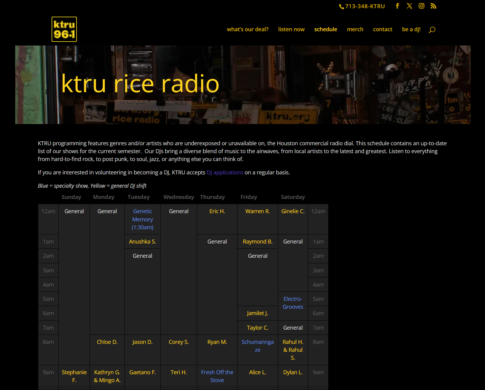
Current State
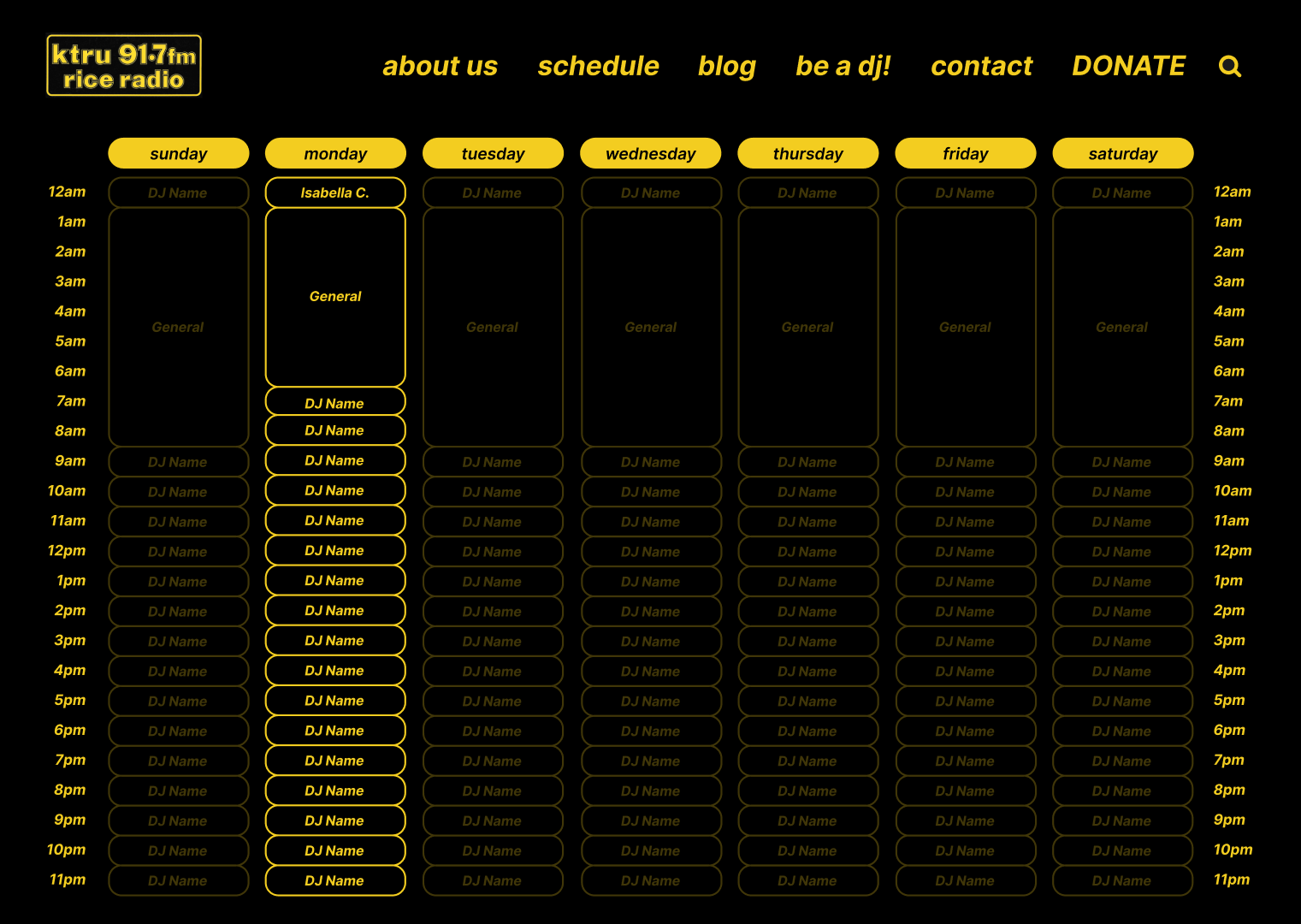
Proposed Redesign
D E S I G N S Y S T E M
Visual Identity
D E S I G N S O L U T I O N S
High-fidelity Design
• More intuitive navigation bar
• Replaced 'Merch' with 'Donate' (client request)
• Bottom playback bar added
• Maintained the aesthetics and colors of the original website
• Information is more organized and easily accessible
• Replaced 'Merch' with 'Donate' (client request)
• Bottom playback bar added
• Maintained the aesthetics and colors of the original website
• Information is more organized and easily accessible
Home
About ('what's our deal?')
Schedule
Blog
Our DJs
Donate
Contact
